 Add Row
  Add
Add 

Why Your Bedroom Color Choices Matter
Choosing the right color for your bedroom goes beyond aesthetics—it can significantly affect your mood and well-being. Psychology plays a vital role in color selection, as certain hues can promote feelings of calm, serenity, or even energy. With our increasingly busy lives, creating a sanctuary where we can unwind is crucial. Thus, avoiding certain colors can be the difference between a restful night and a restless one.
Three Colors to Avoid for a Calming Space
When it comes to paint colors that should be avoided in your bedroom, here are three that don't quite hit the mark:
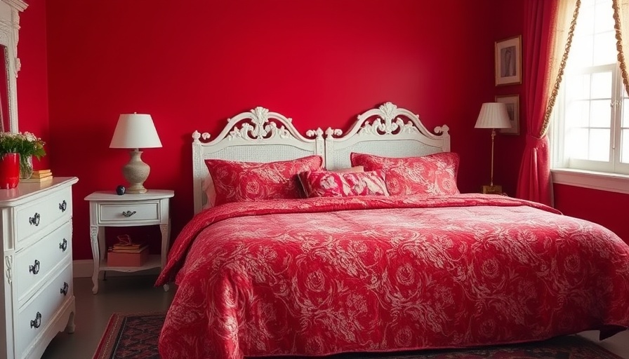
1. Bright Red
While red is an exciting and bold color often associated with passion, it can be overwhelming in a bedroom setting. Bright red stimulates the senses and might increase heart rates, making it a poor choice for a space intended for sleep and relaxation.
2. Dark Brown
Although earthy tones can add warmth and depth, too much dark brown can make a room feel enclosed or oppressive. Not only can it disrupt the flow of light, but it can also evoke feelings of heaviness—certainly not the vibe you want for your restful retreat.
3. Neon Colors
Neon shades are typically lively and can energize a space—ideal for parties, but not for relaxation. Bedroom walls painted in neon pinks, greens, or yellows can convey a frantic energy that may drown out the peaceful vibe you need for restful sleep.
Consider Crafting the Right Ambiance
Your bedroom should act as your sanctuary, and that ambiance largely depends on the color palette you choose. Lighting and furniture arrangement also influence how your color choice feels. Pairing soft blues with white linens can create a beachy, relaxed vibe, while adding some greenery can liven up the space further.
The Power of Color Psychology
Delving deeper into the psychology behind colors can help you make informed choices. For instance, blues tend to evoke tranquility, fostering a peaceful environment ideal for sleep. Greens symbolize renewal and can create a refreshing atmosphere. On the flip side, colors like orange and yellow can be too stimulating and not conducive to restful sleep.
Mixing and Matching: A Balanced Approach
Instead of choosing one shade for the entire bedroom, consider integrating multiple colors to create a balanced, harmonious feel. For example, you can have a calming blue on the walls, complemented by white or cream for the linens and accents. This layered approach adds depth and enhances the room’s overall appeal.
Alternative Color Suggestions for a Cozy Retreat
If you’re looking for suitable shades that create a warm, inviting atmosphere, consider opting for:
- Soft Blues: Inspire peacefulness and relaxation.
- Light Grays: Provide a neutral and calming background.
- Pale Greens: Bring a refreshing natural feel to your space.
Final Thoughts on Color Choices
Ultimately, the colors you choose for your bedroom should contribute to a feeling of comfort and tranquility. Avoiding bright reds, dark browns, and neon colors can help set the right tone for restful nights. Use the principles of color psychology and personal preferences to curate the perfect palette. Happy decorating!


Write A Comment